Duration: 8 weeks
Team
Malin Eriksson
Elin Franzén
Elin Hagman
Mathilda Sörvik
Malin Eriksson
Elin Franzén
Elin Hagman
Mathilda Sörvik
THE CHALLENGE
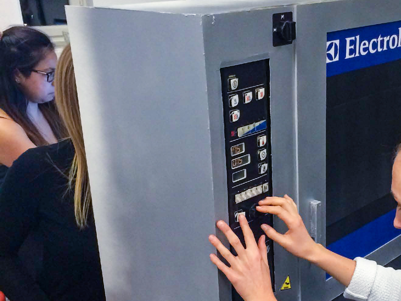
Café Bulten is a busy university cafe driven by students. The facility is often rented by student organisations, companies and even the general public. This means that their oven often has first time users who may only have interacted with household ovens before. The Electrolux CS7 is made for professional usage and also has features not seen in household ovens. Although the staff at Café Bulten are supposed to be expert users, they complain about the oven and how confusing it is to use without the manual.
Café Bulten is a busy university cafe driven by students. The facility is often rented by student organisations, companies and even the general public. This means that their oven often has first time users who may only have interacted with household ovens before. The Electrolux CS7 is made for professional usage and also has features not seen in household ovens. Although the staff at Café Bulten are supposed to be expert users, they complain about the oven and how confusing it is to use without the manual.
Our aim was to test and improve the interface's guessability, satisfaction, efficiency, effectiveness, and expert user experience.
MY ROLE
We all participated in the choice of test and analysation methods, testing and interviewing, model creation, redesign, and report writing.
We all participated in the choice of test and analysation methods, testing and interviewing, model creation, redesign, and report writing.
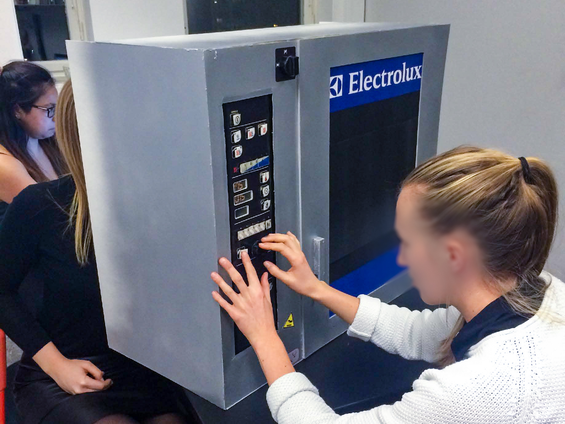
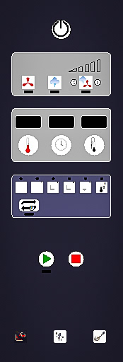
The Old Interface
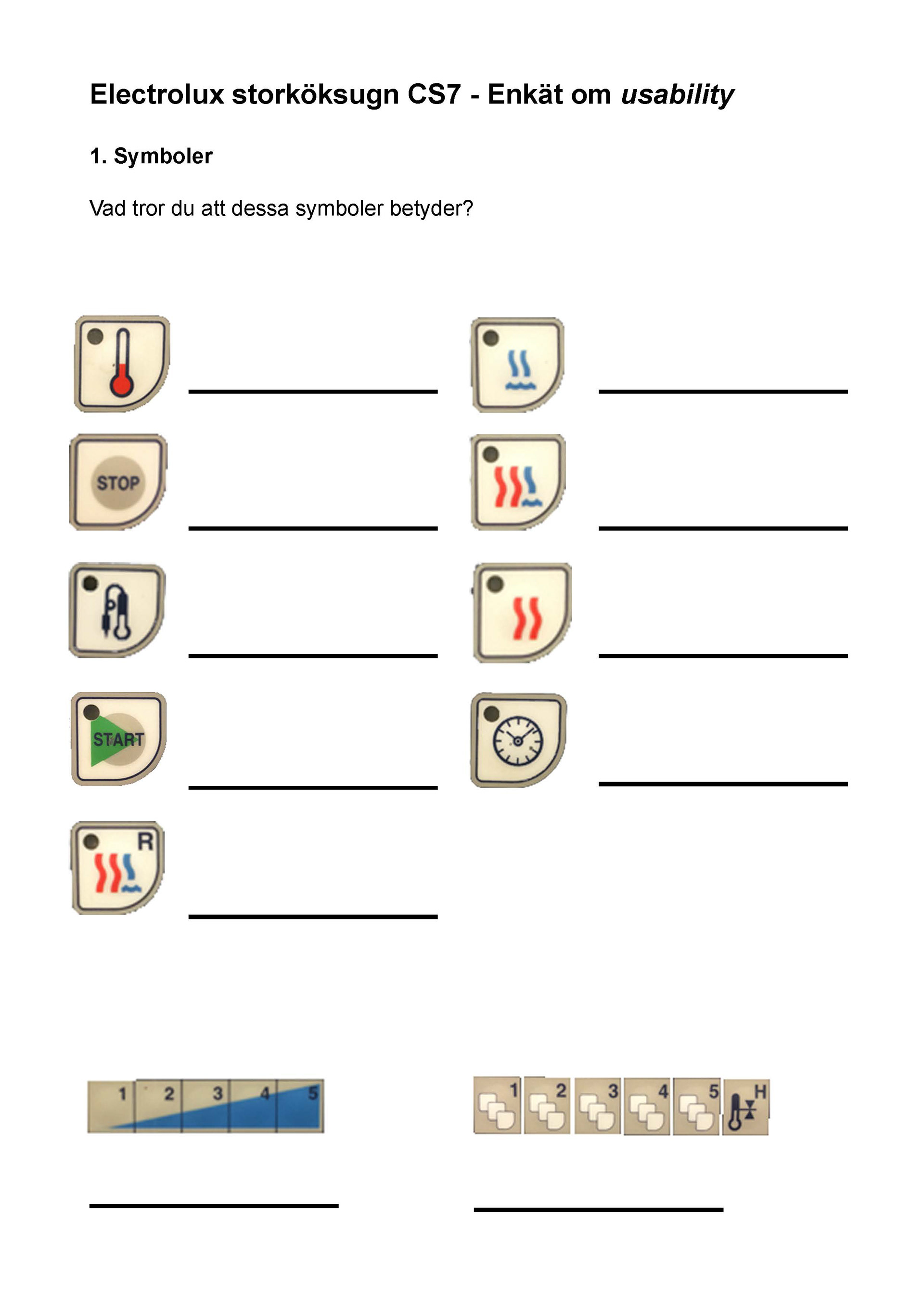
The original interface has 25 buttons, 1 control knob and 3 displays. The control knob's function is connected to the buttons 10, 11 and 12. So, in order to change temperature you need to press button 10 and then turn the knob. We decided to not include symbols 18-20 in our test.
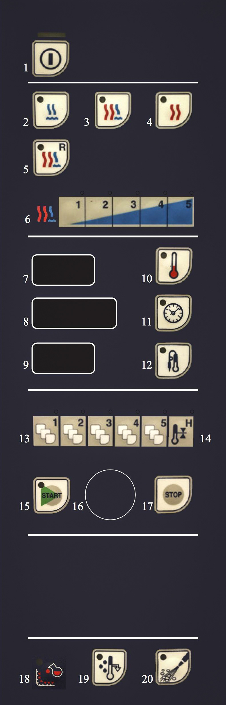
1. ON/OFF - button
2. Steam
3. Kombi
4. Hot air
5. Reheating
6. Steam level
3. Kombi
4. Hot air
5. Reheating
6. Steam level
7. Display: Oven temperature
8. Display: Time
9. Display: Fry thermometer
10. Oven temperature
11. Time
12. Fry thermometer
8. Display: Time
9. Display: Fry thermometer
10. Oven temperature
11. Time
12. Fry thermometer
13. Cooking programs
14. Keep specific temperature
15. Start
16. Control knob
17. Stop
14. Keep specific temperature
15. Start
16. Control knob
17. Stop
18. Descaling
19. Cool down oven temperature or water injection
20. Rinse
19. Cool down oven temperature or water injection
20. Rinse
Figuring it Out Ourselves
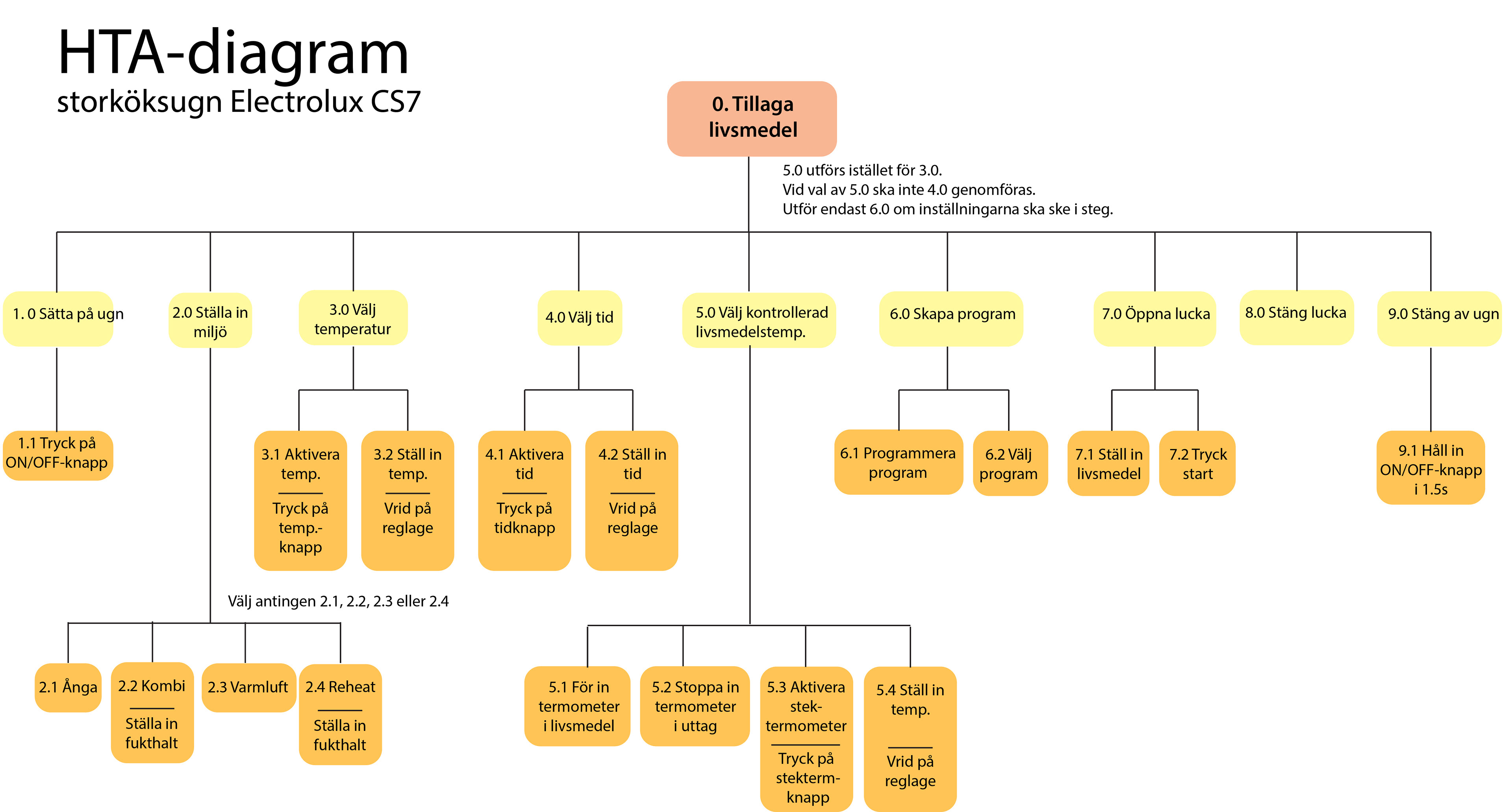
First thing to do was to put ourselves in the user's shoes. To do this, we created a hierarchical task analysis to more easily analyze the learnability of the system. Here we could do a cognitive walk-through and try to predict where mistakes more commonly happened.
Test the Users!
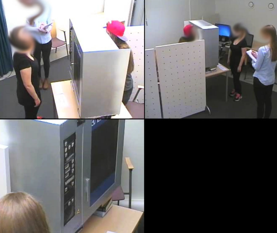
Our plan was to do two usability tests; one for the old interface and a second for the redesigned interface. We gathered six first time users (between-subjects) and two experts (staff from Café Bulten being within-subjects) to do the usability tests.
between-subjects and within-subjects. 6 first time users and 2 expert users - coloured paper instead of lights. also tested symbols with ppl outside the user test to see if words affected their answers.
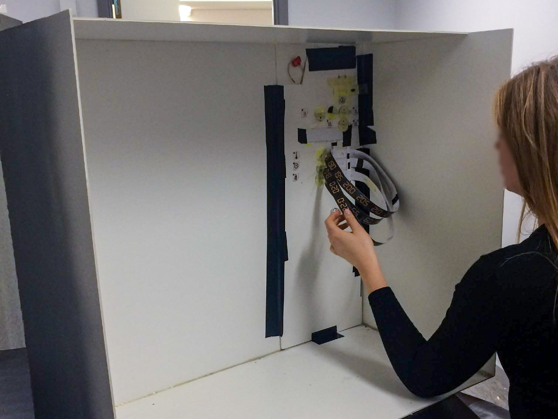
Wizard Of Oz
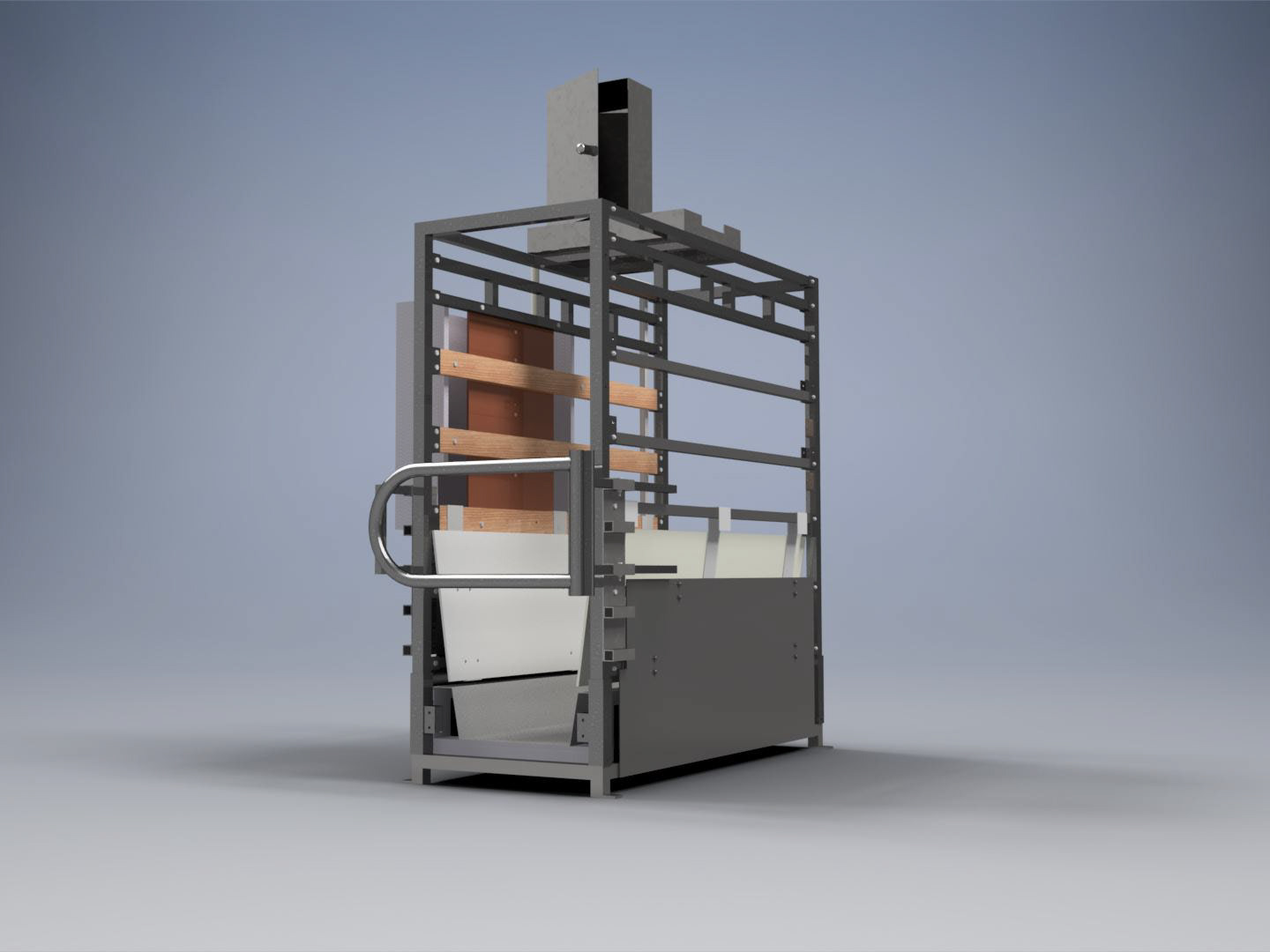
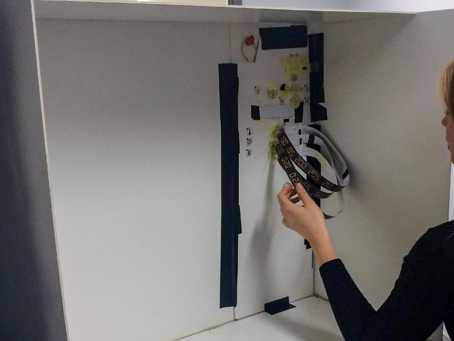
All the testing was done on a homemade foam board model, made by us, in a testing room with cameras and microphones. It was done in a Wizard-of-Oz style - a controlled environment where the user feedback is controlled by a person instead of the model itself. We twisted, turned and pulled on paper bands, clips and elastic bands to give the correct visual feedback. For the person behind the model to know what to do, she had an earpiece where she could hear from the monitor room what the test user was doing.
Using Scenarios
During the activity, the user had to go through 6 scenarios. After each scenario, the user had to rate on a scale between 1-6 how sure they were that the task was completed correctly, and also how easy it was to complete ("1" being the easiest and "6" most difficult). We had two clues per scenario in case the user got stuck and didn't know what to do.
Interview and Symbol Questionnaire
Two short questionnaires about the activity and interface symbols were given afterwards. We wanted to gain more insight to the users' subjective opinions of their experience with the interface. Here are some of the questions the users answered:
How sure are you that you've done it correctly?
How was it to solve the task?
What was your holistic experience using the oven?
How was it understanding the symbols?
(However, for the second round of user testing of the re-worked interface we decided to add the questionnaire about the symbols both before and after the activity to learn more about the guessability and learnability of the symbols.)
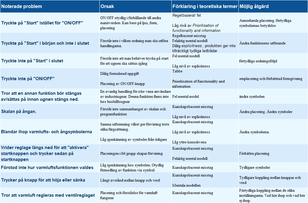
Analyzing Round One
We created a table of all the problems that occurred during the activity. As a group, we discussed the probable reasons behind the problems and what solutions could fix them.
Some mistakes were knowledge-based or because of low explicitness, wrong mental models, low levels of prioritization of functionality and information. One example is that someone pressed the "Start"-button instead of the "ON/OFF"-button to turn on the oven. Maybe the button wasn't distinguishable enough?
The consensus was to improve the guessability by redesigning symbols, re-placing them, and have more clear groupings to increase the explicitness.
An inevitable problem however was the lack of audio and tactile feedback from the homemade model. It did certainly impose some confusion among the users and might have affected their sureness of their success.
A New Interface
The user test showed massive space for improvement. Our users didn't feel satisfied using the product because the symbols and groupings of functions were confusing. We wanted to increase the explicitness of the symbols and also improve the matching between the users' mental models and the system.
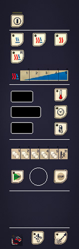
A starting point was to start looking for symbols which were more common in households, i.e. ovens, irons, record players, etc.
To improve the prioritization of functionality and information, we experimented with some of the gestalt principles, specifically similarity, proximity and common region.
The old interface had many switches. To switch it up (pun intended) we switched out (yes, again) the buttons to knobs for temperature, time and reheating to minimize the gap between the system and the first time users' mental model.
An Improvement
Another test round was done with the redesigned interface. Six new first time users were invited and the same expert users from previous test came as well. We received some positive feedback and the data showed us some improvement.
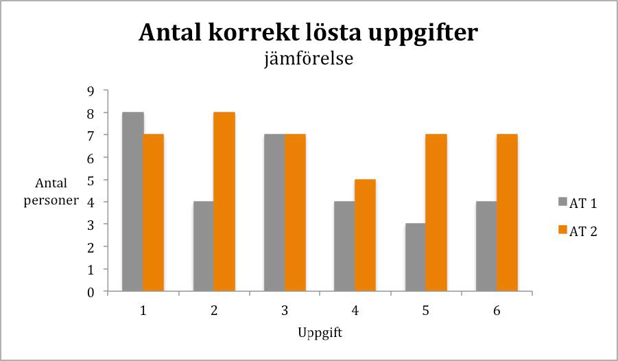
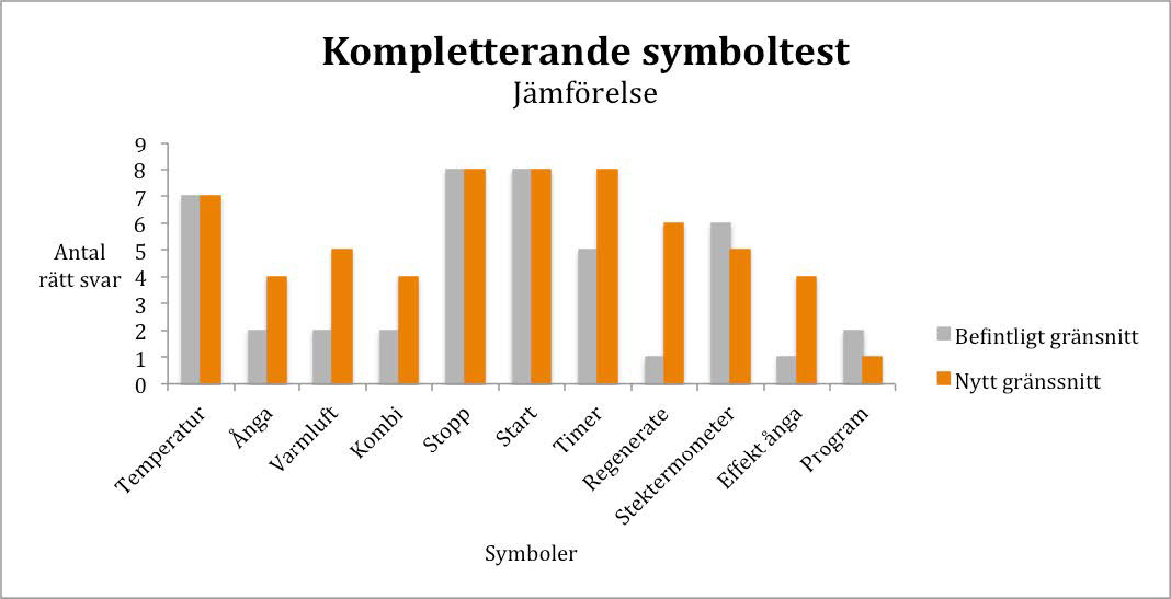
Objective Results
Here is a comparison between the user tests of both the old and new interface. On the left, number of successful people per task. On the right, number of correct answers per symbol. We can see that the majority of the scores improved with the redesigned interface.
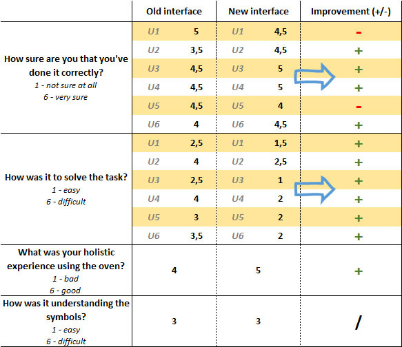
Subjective Results
After each scenario, the test users answered questions about their sureness of completing the task, how easy it was to solve, their experience of interacting with the interface and the symbols.
As we can see here, there is an overall improvement. However, the understanding of the symbols themselves hasn't changed, which could mean that the rearrangement using gestalt principles of the interface contributed to the improvement.
Result
effectiveness has improved because of an increase of solved tasks.
efficiency has improved because the number of incorrect actions has decreased.
satisfaction has improved because the holistic experience got better.
efficiency has improved because the number of incorrect actions has decreased.
satisfaction has improved because the holistic experience got better.
guessability has increased because more test users managed to complete the tasks correctly.
experienced user performance has improved because the expert users said they preferred the redesigned interface.
learnability seemed good from the start, but more test users were able to solve the last tasks in the second user test. Therefore we deem it improved as well.
learnability seemed good from the start, but more test users were able to solve the last tasks in the second user test. Therefore we deem it improved as well.