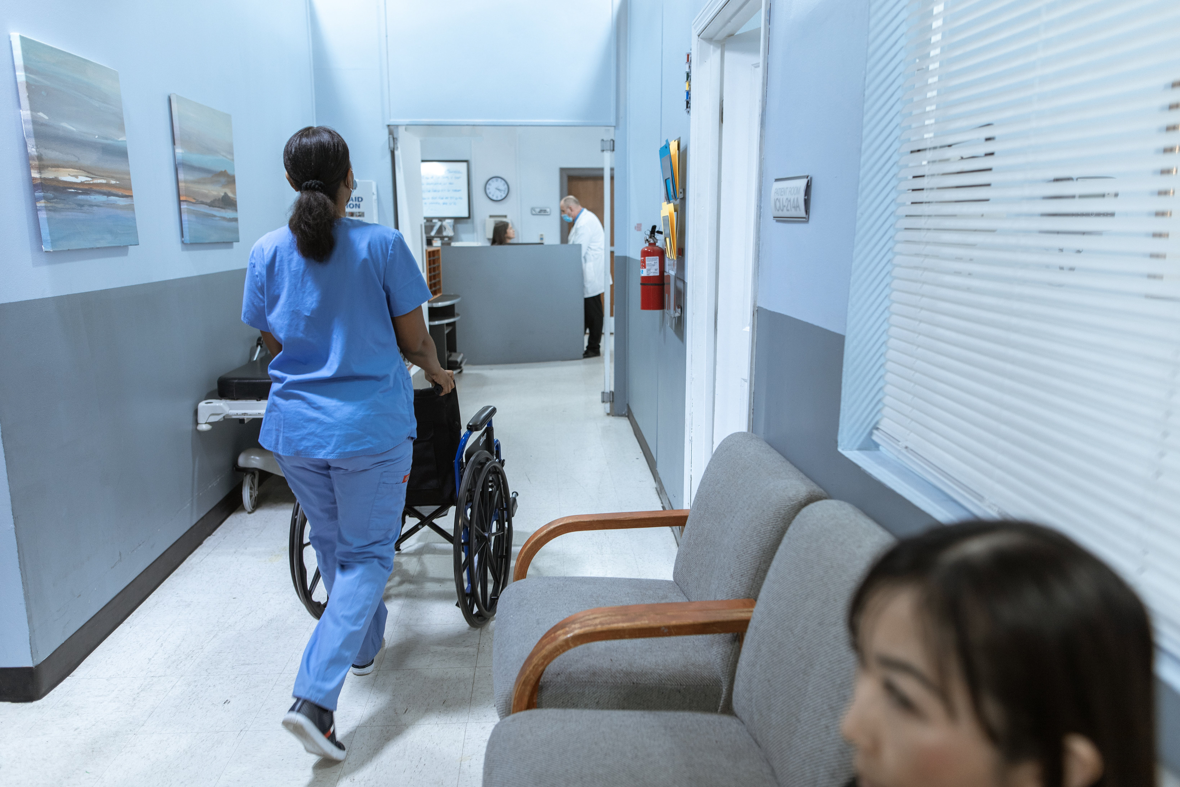
In a team of five industrial design students, an experience for visiting a medical practice was designed for in three steps: understanding UX, designing for UX, and evaluating UX.
We used Pieter Desmet's model for designing for emotions as an approach.
My responsibilities were:
• Design and conduct qualitative research
• Find and interview users
• Compile and analyse data
• Create concepts
• Find and interview users
• Compile and analyse data
• Create concepts
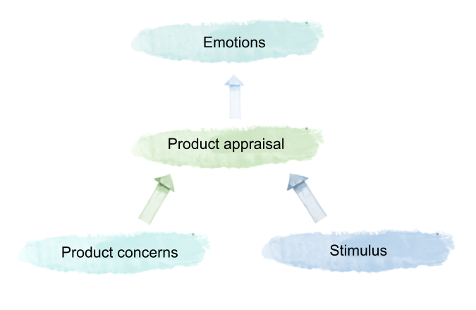
Desmet's Model: Design for Emotion
Our Chosen Concept
This concept was chosen to improve the visitor's experience of feeling satisfied, in control, seen and heard, taken care of, and embraced. It includes the whole visit from when the visitor steps into the medical practice until they leave.
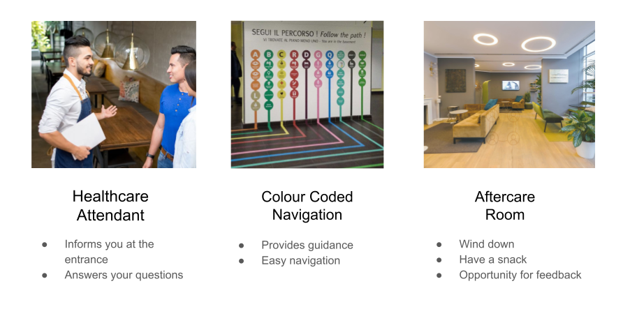
It focuses on creating opportunities for the visitor to gain information about their visit and to communicate with the medical practice to improve their services.
The evaluation of the concept revealed that the users would find this type of visit attractive and give a sense of safety and control. They also say they would appreciate having someone guiding them, but felt neutral about using the "aftercare room".
1. Understanding UX
In this step, I interviewed users and identified UX goals.
The target demographic was all potential adult careseekers in Gothenburg which resulted in ten separate interviews with people between the ages 22 to 84. The interviews included:
• Positive and negative experiences: Love and hate stories.
• The entire healthcare process from booking to follow-up.
• Emotions: How did the user feel and why?
• Product concerns: What was the user expecting?
• The entire healthcare process from booking to follow-up.
• Emotions: How did the user feel and why?
• Product concerns: What was the user expecting?
From these interviews, we discovered that the most important aspects to a good experience were information and communication which affects the visitors' sense of feeling seen and heard. If this was done well, long waiting times are experienced as less negative. They also valued the ability influencing their care.
UX-CURVES
To gain a temporal view of the users' experiences, the project group interpretated the love (left diagram) and hate (right diagram) stories to create UX-curves of the users' experiences of when they got an insight about the need of medical attention to receiving aftercare from visiting a medical practice.
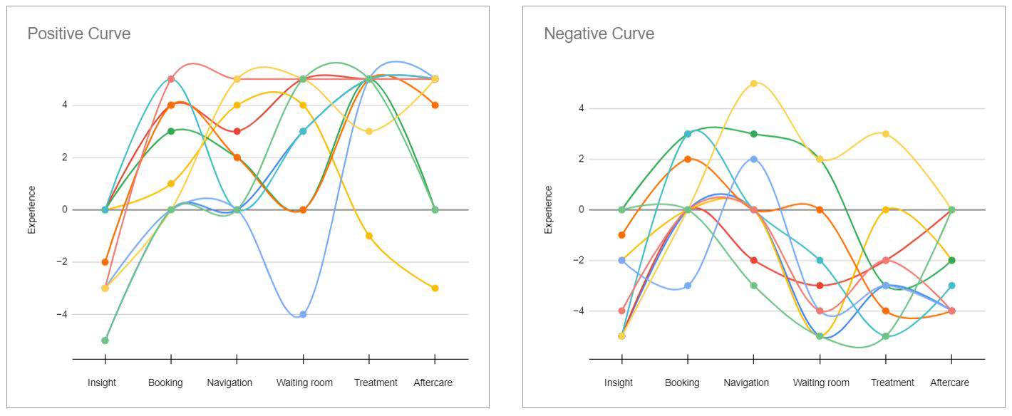
The project group interpretated the love (left diagram) and hate (right diagram) stories to create UX-curves of the users' experiences.
A common denominator was that love stories tended to finish on a positive value, while hate stories ended on a negative value. This lead to us believing that the concept should provide something positive at the end of the visit to improve the overall experience.
UX GOALS
The users' emotions and experience during a visit at a medical practice were heavily affected by clear information and information sharing. Emotions that we encountered were social and instrumental emotions, such as indignation, disappointment and dissatisfaction.
The identified problem area could therefore be that a user doesn't feel included in their medical visit nor treatment based on lacking information and communication.
Based on this, five UX goals were created and were criteria to fulfill during the concept generation phase.
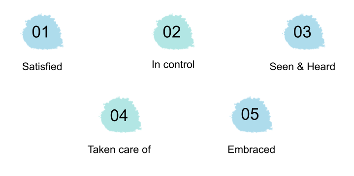
Five UX Goals derived from analysing qualitative data from user interviews.
2. Designing for UX
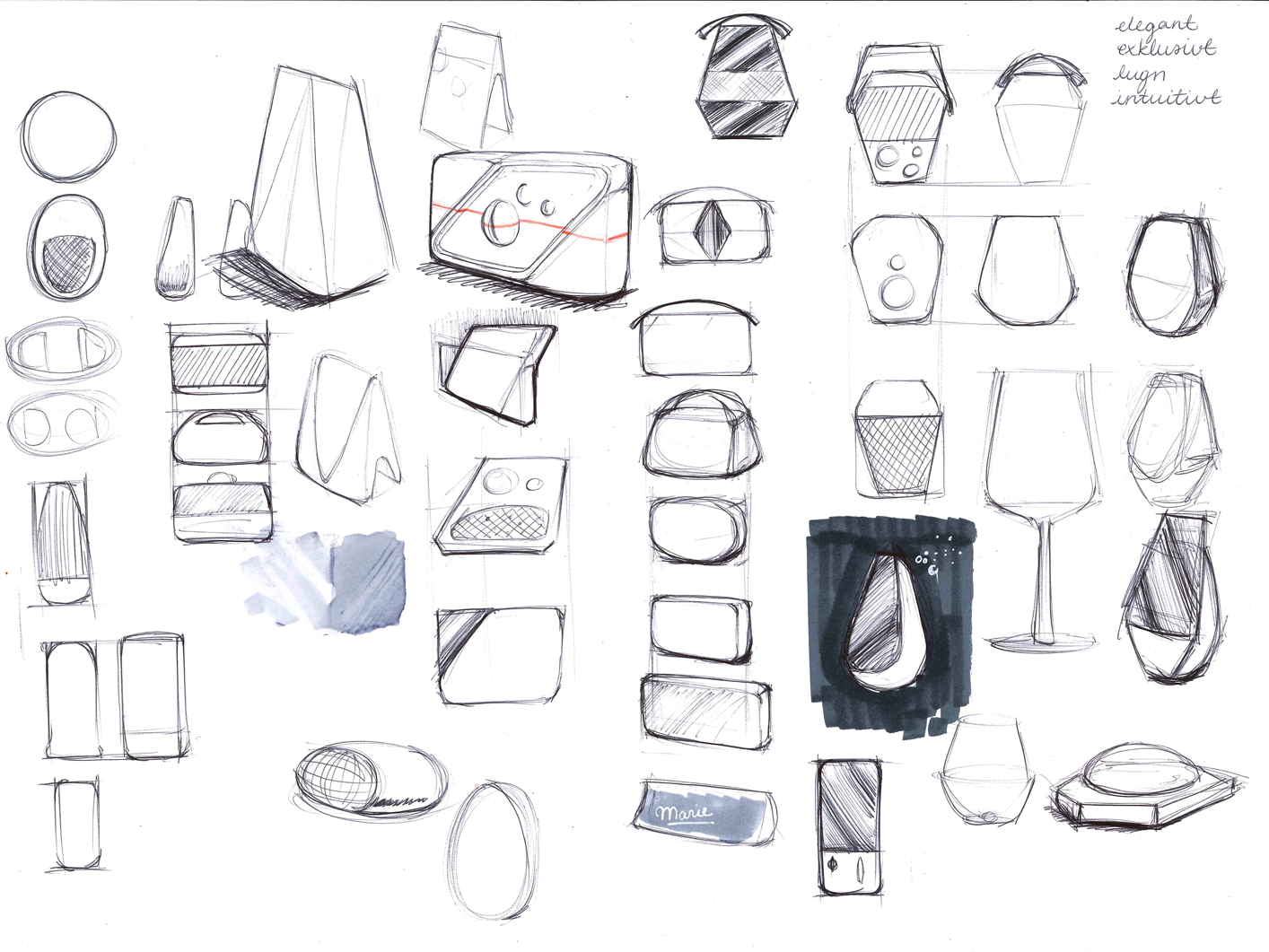
In this step, we created three concepts.
We brainstormed around the terms "communication", "information", "control of one's well-being", and "added-value", although it felt as if we were not thinking out of the box. Instead, we took an a narrative approach where we shared memories and situations where we feel taken care of, seen and heard, embraced, in control, and satisfied.
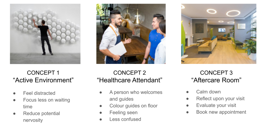
The first iteration of concept generation lead to three concepts.
COMPAIRING AND CHOOSING CONCEPT: PUGH MATRIX
The concepts were put against the UX goals and a couple other important factors which were all weighted equally. The Healthcare Attendant and Aftercare Room both received high scores which lead to us merging them together to create a final concept.
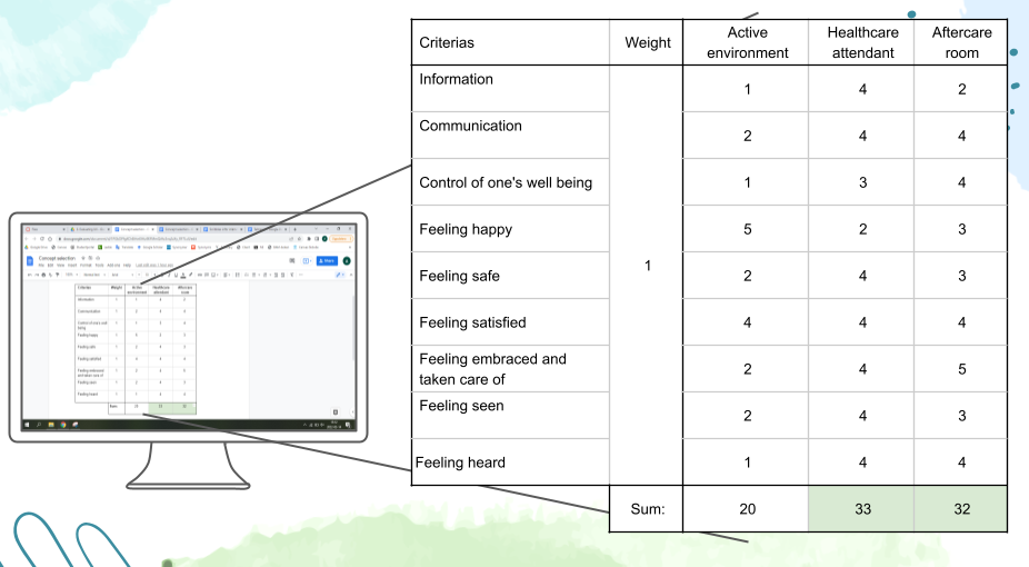
A PUGH matrix was used to compare the three concepts against each other.
3. Evaluating UX
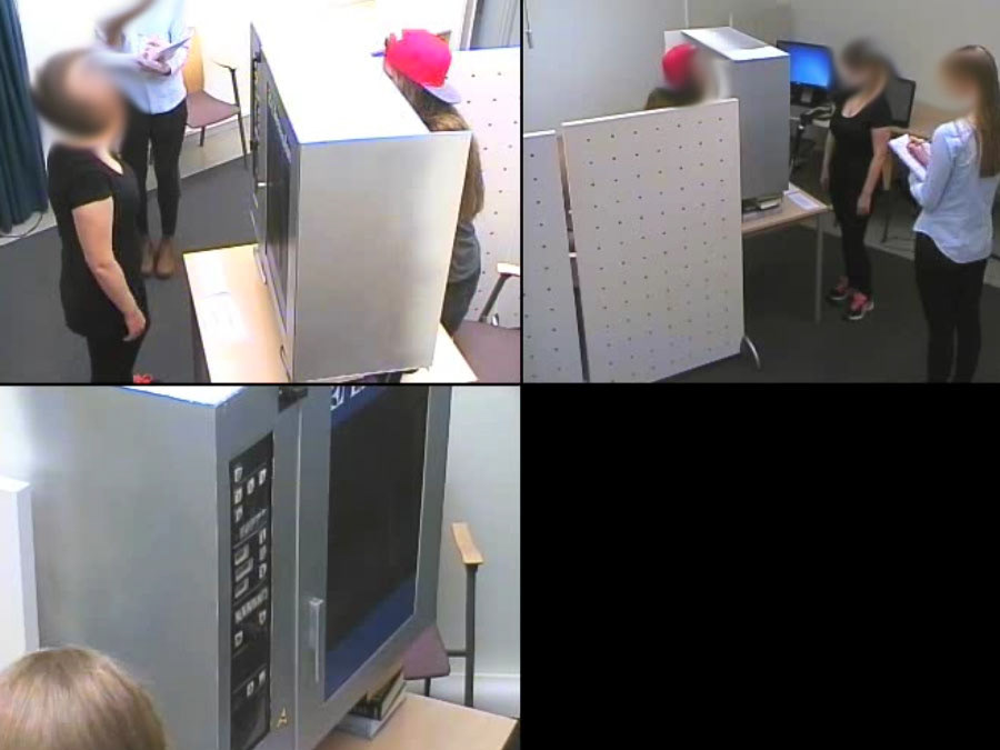
To evaluate our chosen concept, six users were interviewed and emerged into our concept by using a scenario of a hospital visit. We showed pictures and created a story of what was happening in each step of the visit. After each step, we asked the user to describe how they feel according to a SAM-scale (Self Assessment Manikin).
The SAM scale revealed that the users felt high pleasure and dominance, and low arousal with the "Healthcare Attendant" and "Colour Coded Navigation". The users were however only neutrally affected by the "Aftercare room" on all three measures.

Scenario combined with SAM-scale.
After the whole scenario, the user was presented a few statements about the imaginary visit and responded how well the agree with each statement in a Likert-scale.
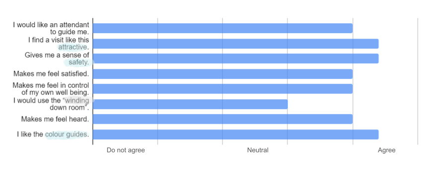
Results from the Likert-scale
Conclusion
Of course, it is difficult to directly affect the care the visitors recieve, but us designers can try to improve the visitor's experience of their visit. Two major factors affect visitors' experience: information and communication. If these factors are well done, visitors are not as bothered by, for example, long wait times.
If I would do anything differently for this project, I would visit a medical practice e.g. a hospital or dentist to directly speak to visitors and staff. But this project occured during pandemic restrictions at medical practices, and therefore it was not appropriate to visit them at the time.